Dishcovery
Product & Web Designer | January 2021 - June 2024
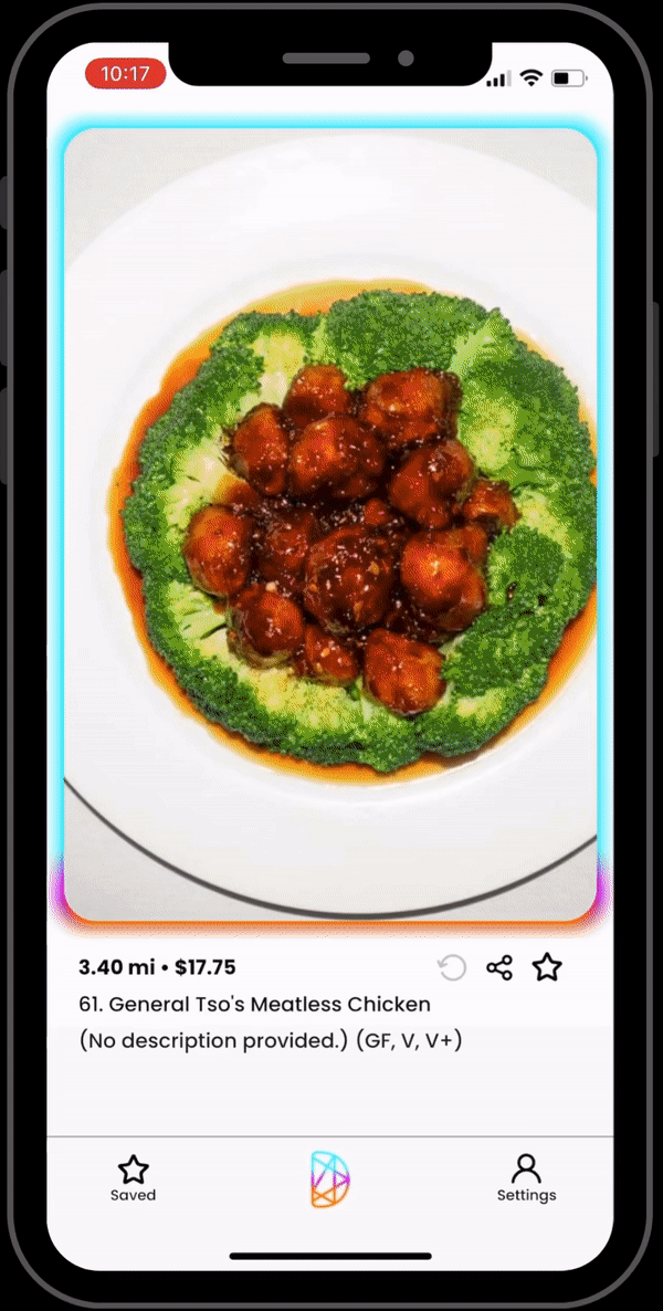
Tinder for food: find your perfect match. Dishcovery is the first food exploration platform that cultivates an explore and discover experience steered by our unique algorithm.
Beta version out now. Currently serving the Bay Area.
Analyze
There are many products like Google, Yelp, and Uber Eats that already exist, but they focus on providing a bounty of information to users, which can actually make the process of finding new food more challenging.
I analyzed the previous design based on feedback from users to improve the overall look and feel of the app.
Existing Design (June 2021)

Define
Purpose
- Why? To encourage people to find and try new food
- How? With every swipe, our algorithm and machine learning presents a new dish based on what the user likes/dislikes
- What? A search and explore app for food
Problem
Experiencing new food and culinary flavors at restaurants is one of the best features of living in a city—particularly in San Francisco. However, the process of searching for new food and making a decision is often cumbersome, painful, and can take forever. Therefore, this project is dedicated to re-envisioning the food app experience to make discovering new dishes (i.e, dishcovering) more fun, easy, and engaging.
Existing Design Critiques
Participants had trouble with the interaction of making the dish "cold" or "hot." The buttons felt like additional work, whereas swiping would feel more natural. Users also felt no indication of the algorithm. There was no flow of information or specification of tasks users should accomplish. The call to action was unclear.
Ideate
- Single picture of dish is main focus (takes up >50% of screen)
- Show that dish is getting closer to what user wants with an indicator
- Utilize vertical scrolling
- Create "gamified" feeling to increase swiping
- CTA is for user to order the dish
Wireframes

Color Exploration

Select
Based on the design changes and variations, majority of our testers preferred to have color surrounding the image with blue symbolizing "cold" and orange for "hot." Additionally, they liked having the CTAs hidden beneath the image. Therefore, I wanted to reduce as much text on the home screen as possible and hide all information under a vertical scroll.

Prototype
Key features:
- Left, right, up, down swiping on Home screen
- CTAs - map, order, website
- Change distance, price, and dietary preferences in Settings
Evaluate
Our user testers were able to successfully find and order a dish. Although there are a few bugs in the current code, we are learning what our users want out of the app through user interviews.
Takeaways
- Show (rather than tell) the user that they're getting closer to something by using animations and icons
- Hide any excessive information in menus
- Focus on key features and build on top of those based on feedback
More...
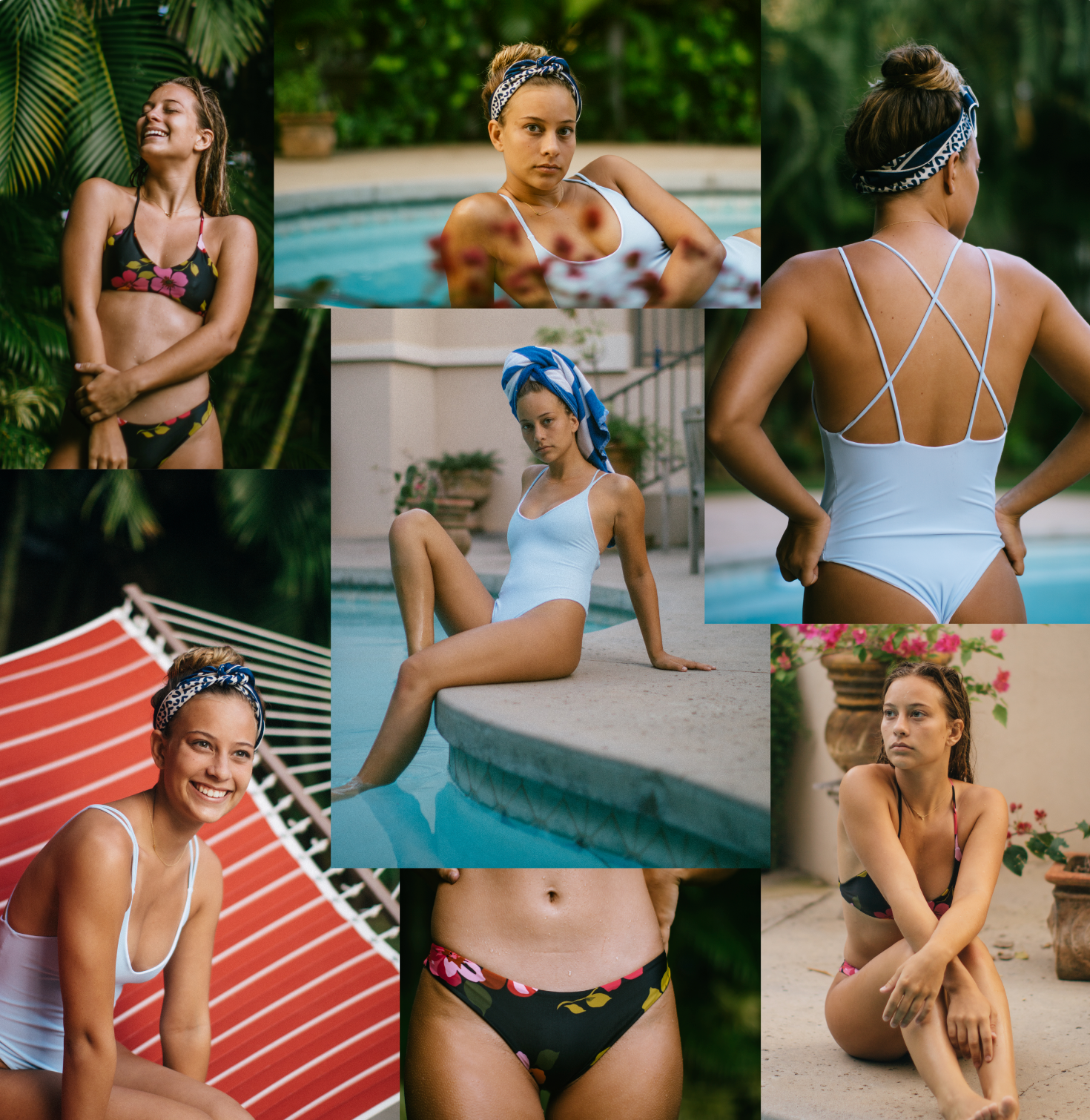
Miya Swim
Custom, small batch swimsuit brand inspired by Hawaii's scenery and my Japanese heritage.
Product design + marketing
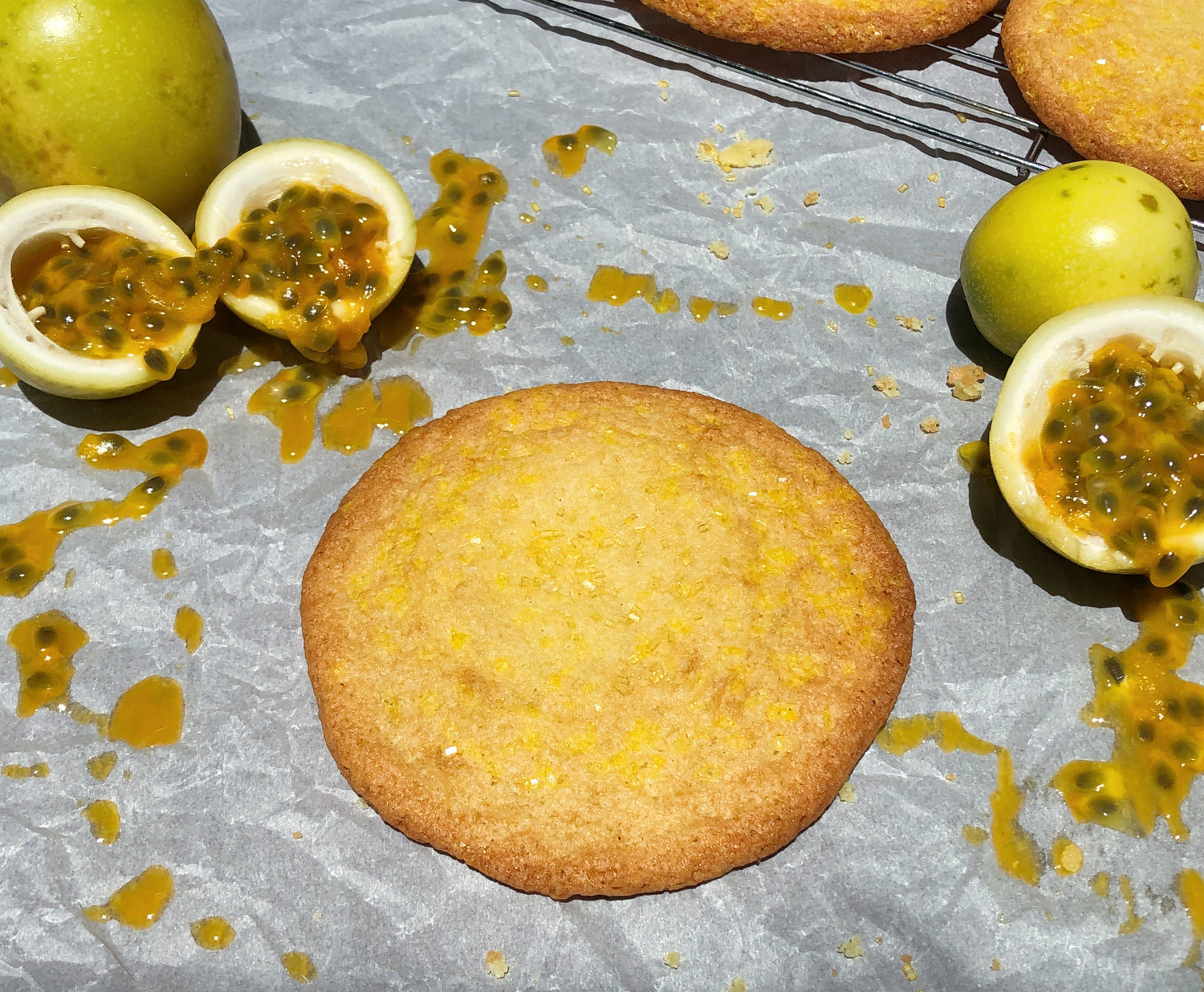
Pineapple Town Market
Nostalgic Hawaii-inspired snacks and goods made from generations-old recipes.
Product design + marketing